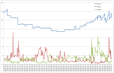
I’ve been testing the data collection code and trying different ways of reading and presenting it.The chart below is an example of what can be produced from the data.
This data, from a UK greyhound race, is for one runner and covers the last two minutes of trading before the scheduled off. The blue line is the LTP (last-traded-price). The red and green lines are the WOM (weight-of-money) values on each side. On this particular chart there appears to be some connection between periods of WOM in one direction and the trend of the LTP. From the left as LTP is falling, WOM is pushing in the downward direction (red line). Then from the centre, as LTP is rising, WOM is pushing upward (green line). More testing required.